Example 1: Using a pie chart displays the data of the food preferred by the students.
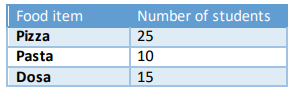
We have the food item preference of 50 students. Let us now visualize the data using a pie chart and find the most preferred and the least preferred food item.
Let us now visualize the data using a pie chart:
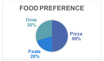
The most preferred food item is pizza and the least preferred food item is pasta.
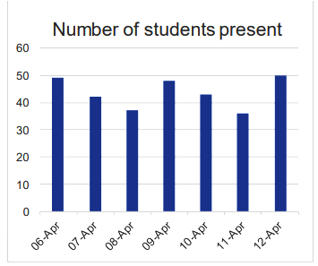
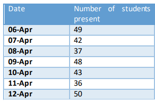
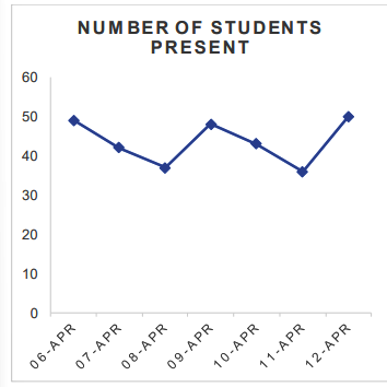
Example 2: Using a line chart displays the data of the number of students present in the class for one week.
Here is the data:
Let’s now visualize the data using a line chart
We can also visualize the same data using a bar graph: